Seoses ühe eraldiseisva projektiga analüüsisin Tallinna trammide sõitmist sõiduplaani järgi ja nende hilinemisi. Analüüs ise on seekord inglise keeles.
What and why?
I decided to analyse Tallinn public transportation data. About 2 years ago I made a little visualization for my personal data project, called Tallinna ühistransport ühes päevas. For that I gathered GPS data from public API for buses, trams and trolleybuses, https://transport.tallinn.ee/gps.txt. From that time I had a to-do task for myself to analyse public transportation arrival data to identify delays and to find out other interesting patterns.
I decided to limit this analysis to tram rides only, because the data gathering for all public transportation would need more computing resources and a little bit more time.
Data and analysis execution
Tallinn tram rides data is gathered from Tallinna Transpordiamet public API. Basically the API call provides data for public transportation trips arriving in one hour to the selected stop. For every trip it shows the scheduled arrival time and actual expected arrival time. For example the API call for Hobujaama stop. It is the same data, that is shown on some of the bigger bus terminal (e.g. Viru bus terminal) outdoor screens and on this live map https://gis.ee/tallinn/.
To gather the data I wrote an R script that pulls data for every tram stop (118 in total) in Tallinn and scheduled it to run for a 24H period (16.04.2018) in every 2 minutes. After the data pulls I had ~1M rows of tram arrival data. For the analysis I combined the API data with tram timetable data, scraped from https://transport.tallinn.ee/#tram. After lot of pre processing I had a data table, that consists of every tram trip scheduled and a actual arrival time to every stop in Tallinn, ~17 000 rows in total.
All the data gathering, data preperation and -visualization was done in R.
Analysis focus and goal
Before the analysis I identified 2 main hypothesis that I’m trying to prove or disprove with the data in hand:
- There are certain bottlenecks on the tram lines that cause most of the delays.
- Most of the delays occur on the rush hour.
Besides those goals I was also keen to compare different tram lines with each other and do the exploratory analysis to find anything else interesting.
Results
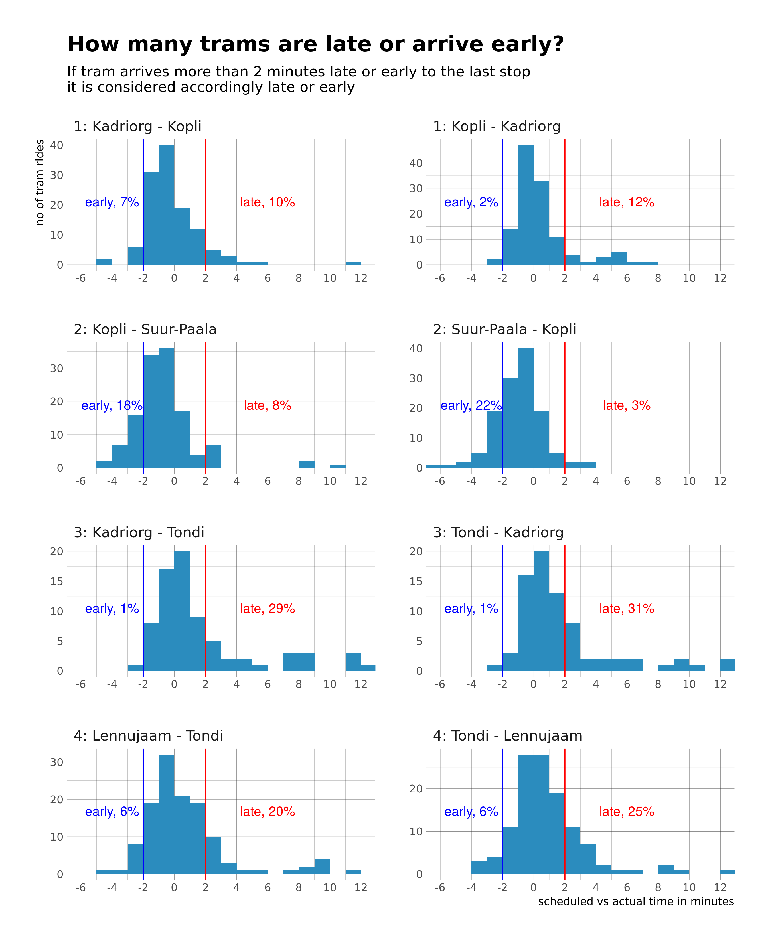
How many trams are late or arrive early?
On the chart below, I compare the distribution of each tram ride actual arrival time with the scheduled arrival time to the last stop. As it is subjective whether tram is late when it arrives 1, 2, 5 or 10 minutes late, I arbitrary chose 2 minutes for the late/early milestone.
It appears that the % of trams arriving late or early are quite different for tram lines. About 1/3 of tram number 3 (Tondi - Kadriorg) trips arrive late to the last stop and almost none of the rides arrive early. On the other hand, only 5% of tram number 2 (Kopli - Suur-Paala) trips are late and around 20% arrive too early. To sum it up, it seems, that the trams riding to or from Kopli are less prone for delays than those riding to or from Tondi.
Tram actual vs scheduled arrival times in all stops
As the distribution chart shows, tram lines are quite different when it comes to the % of delays, but what about timing of delays and bottlenecks that cause delays…
Charts below are interactive, with tool tips, zoom etc.
Further analysis
To make some more solid conclusions on the tram delays, it is definitely necessary to collect data for more than one day and to use a longer period of time to choose the data collection days from. It would also be very interesting to do a similar analysis on buses delays, as they are probably much more affected by the overall traffic (separated bus lines are only in city center and on some major roads).
Detailed scripts for data gathering and -preperation are on Github: https://github.com/toomase/trammide_hilinemised.